Top Stories

SU’s African American Studies continues call for resources as Trump plans to defund ‘woke’ studies
Students and faculty in AAS say the department lacks adequate resources and are worried for its future under the Trump administration. Read more »

MakerSpace creative hub to relocate to Marshall Street
The Kimmel MakerSpace will close for SU’s demolition of Kimmel and Marion halls before it relocates to Marshall Square Mall in Spring 2025. Read more »

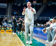
Gerry McNamara forges new path at Siena after 19 seasons with SU
After 19 years at Syracuse as a player and coach, Gerry McNamara took over the head coaching job at Siena. Read more »


I thought when reading the headline that this would be a graphic that compared the various building campaigns that occurred during each chancellors’ tenure, (i.e. 12 campus plans at the beginning/end of each) showing the most recent campus expansion into the city. That would be a more interesting study.
SU has put up some good looking building… that have stood the test of time from a design perspective. AND SU has some disasters. If SU had stayed with a similar classical look (and neo-cassical), the campus would look much better. Instead SU goes with the ‘most modern’ trend of the time, which becomes outdated in 15 or so years. Example: the new Newhouse building. Hence, we have an odd mix of styles… some beautiful (Crouse, HOL, Hendricks, Maxwell), some okay, and some horrible (just about anything built between 1940 and 1980).